NUDE FOR PERNOD RICARD
Jameson
The evolution of a brand
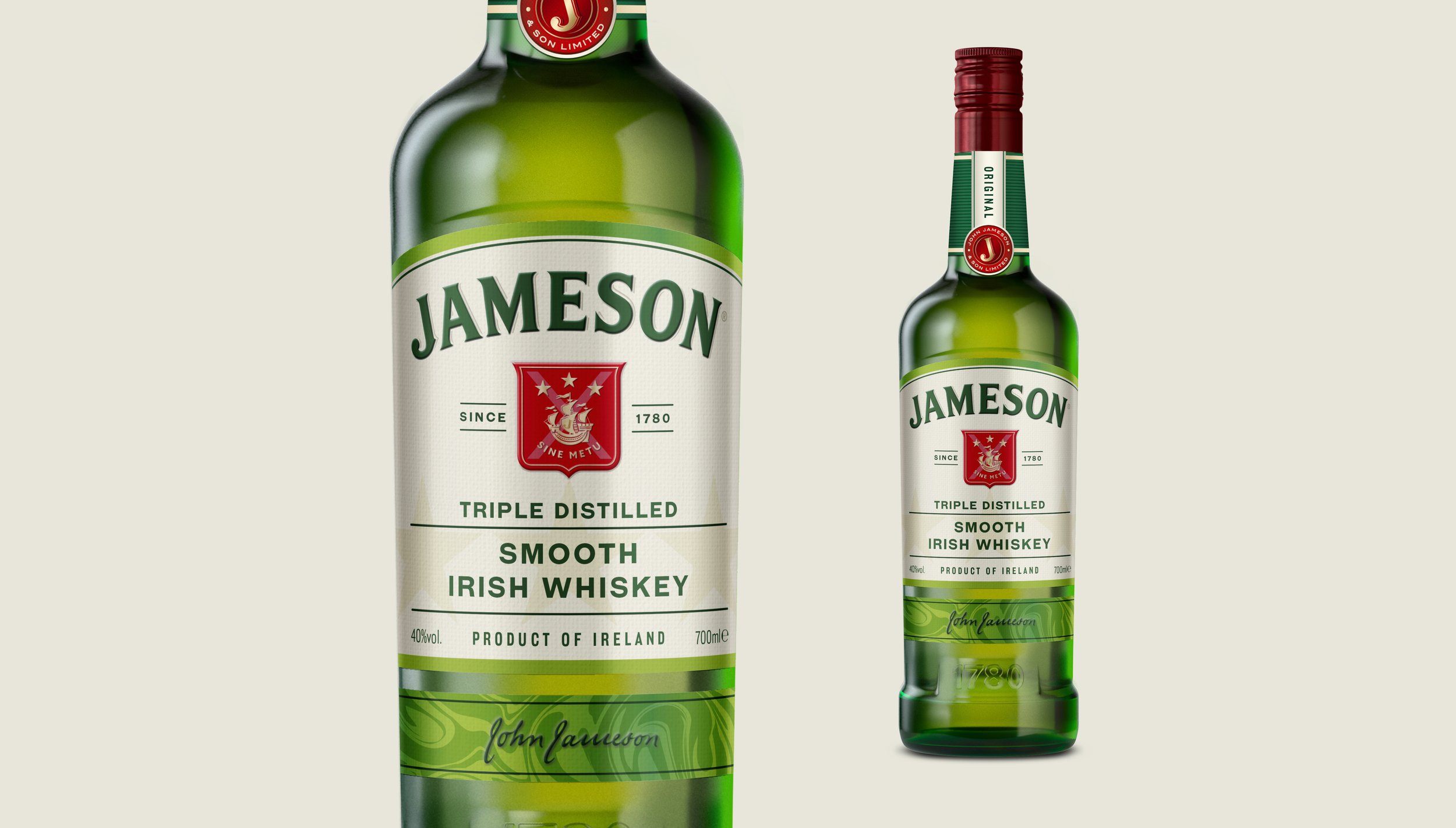
Refreshing a major brand like Jameson required identifying the key take outs from the consumers perspective and
applying small changes that enhanced the established
look and feel.
A more vibrant colour palette instantly lifted the packaging and provided more stand out on the shelf.
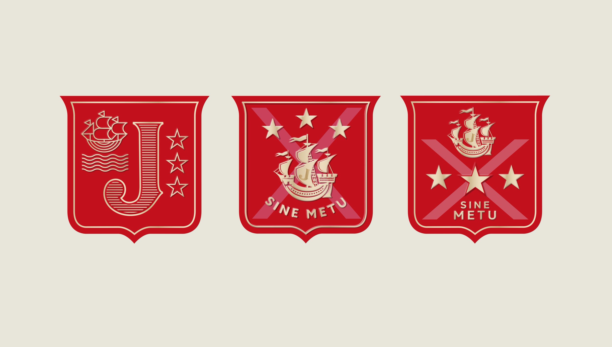
The shield was simplified in terms of elements, while the ship was redrawn to add more craft into label. The bottom band evolved to be more expressive for each variant and
modernise the label.